
The Japanese weather satellite Himawari-8 sits 22,000 miles from Earth in orbit. On August 5, 2015, it peered down at the half of Earth that it can see, a hemisphere with Japan at its center.
What did it see? August 5 was a fine day in Sydney, Australia. Overcast with wintry clouds, temperatures still almost climbed to 60 degrees Fahrenheit. The sun set in the late afternoon, while many people were still at work, after which temperatures fell.
In Hong Kong, meanwhile, it was swelteringly hot, 93 degrees, hotter than the city almost ever gets. Three days later, the city would experience its hottest day ever.
In Unalaska, the most populated city in the Alaskan Aleutian islands, it was an average midsummer day: cloudy, low 50s, and very bright. The Arctic sun rose during the seven o’clock hour and it did not set until almost 11 p.m.
All these different ways of experiencing that one day—August 5, 2015—are captured in a remarkable online visualization called Glittering Blue. It reduces one day of satellite imagery across a hemisphere of Earth into a looping 12-second film.

Five times in a minute, the sun rises golden on the western horizon, skitters clouds and condensation across the tropics, burns a shiny reflection through the Pacific, and sets in the east.
It’s satellite imagery as you’ve never seen it before. It simply looks like the Earth. I can only recommend going to glittering.blue and scrolling around.
Glittering Blue was created this weekend by Charlie Loyd. During the day, Loyd is a satellite-imagery analyst for Mapbox, though Glittering Blue is a side project. Himawari-8 captures a full-disk image of Earth every 10 minutes, and an image of Japan of similar quality every 150 seconds. It sits in high geosynchronous orbit over Japan, which means it orbits the planet exactly as quickly as the Earth rotates. It is always “synced” to Japan. That’s why it shows so much more of the Earth than other satellites and also why it shows this part of the Earth.
This is, in fact, the only part of the Earth for which imagery like this exists. The fleet of U.S. weather satellites that would rival Himawari-8 and capture North America is not due to launch until late this year; that fleet will also not be able to capture true-color imagery comparable to Himawari-8. Right now, comparable data for the United States looks like this:
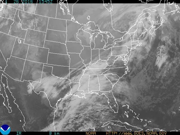
(When animated, it looks like this.)
Hawaii and the Aleutian Islands of Alaska are in the Glittering Blue picture, though both are obscured by cloud. For ease of comparison, the Big Island of Hawaii is about as large as a mouse cursor.
Loyd isn’t only an imagery analyst and writer, he’s also my friend. I spoke to him Monday about whether the colors of Glittering Blue look as vivid as they’d be from space, what is climatologically happening in the photo, and the complicated value of photos of the whole Earth. Our conversation has been edited for brevity and clarity.
Robinson Meyer: Why are the colors in the photo—the orange of the Outback, the lighter blue water around Australia—why might those colors look different from other images from space that people have seen?
Charlie Loyd: So there’s a lot of factors. One thing is weather: Things look different on different days. That can be seasons, that can be that it just rained so the sky is clear, it can be an algae bloom. There are a whole bunch of reasons for what you’d call intrinsic change—change you could see if you were just standing there. Like haze—which gets to philosophical questions like, if China is always hazy, do you try to remove that?
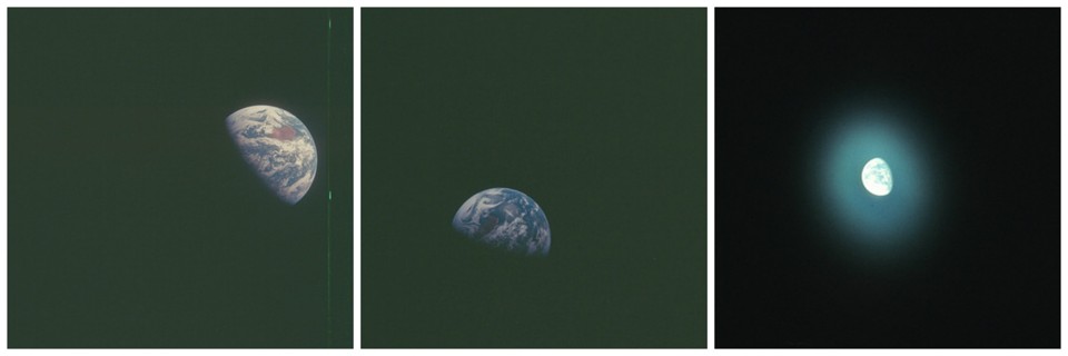
So there’s intrinsic change. Then there’s that different sensors see different colors, about the same degree as different brands of analog film record colors differently. Like there’s portrait film and landscape film, and they’re both basically accurate? But if you take a picture of someone with landscape film, it will be kind of unflattering, and a landscape with portrait film will be kind of boring. And this is something I tried to highlight in the Q&A by linking to different Apollo photos, and how it looks different just with slightly different camera settings and different rolls of film.
Every satellite has a different set of sensors. Often what’s called the blue sensor does not exactly align with what your eye would pick up. This is also true of everyday cameras, so if you point a TV remote at an iPhone camera, you can see this weird little blue light, and that’s the equivalent. The RGB sensors in an iPhone camera are not exactly how your eye would perceive the color blue, and often there are colors—like, say, purple under fluorescent lighting—that will look different to different cameras.
So there are sensor differences. And because satellites are typically not designed for aesthetics, they don’t try particularly hard to match those to the human eye. They’re all going to see something slightly different, and lots of subtle colors will just be a little bit different. One thing I’ll do is go to Flickr and just, look at pictures from whenever, and try to get a sense of the overall color of the land.
And it’s tricky because—now we get to atmosphere correction. Are you trying to make it look exactly like it would from space if you just glanced at it? Are you trying to remove the effects of the atmosphere, so everything’s the color if you looked down at standing level? What are you trying to do?
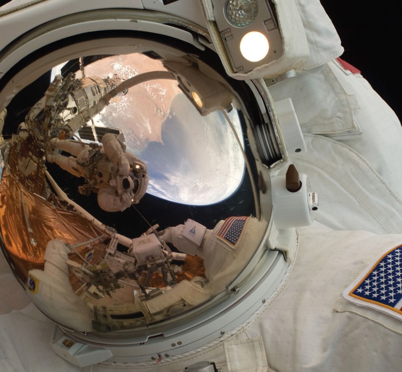
Added to this: The human visual system is really complicated and very adaptive. If you’re an astronaut, and hypothetically your visor perfectly transmits visible frequencies—which it doesn’t in practice, it has a gold coating, and you’re going to see color a little bit differently—then you’re going to see this bright thing in the sky. It will be much brighter than the moon. You think about how the moon looks on a perfectly dark night, like you’re out in the wilderness, you look at the moon, it looks really bright because your eyes are adapted—the Earth is going to be brighter than that, against this inky, inky black background, the darkest thing you’ve ever seen.
As an astronaut, the Earth is going to look really weird, and your eyes are going to have a little bit of trouble adjusting. Eventually, if it’s all you have in your view, your brain is going to start seeing through the haze. And what looked at first like a muted red in Australia is going to look brighter as your eyes adapt.
That’s a very hard process to quantify, and I would love to talk to an Apollo astronaut about it, but everything you see is some form of a best guess.
Meyer: Would an Apollo astronaut have a different view than a Station astronaut?
Loyd: Yes, because a Station astronaut is going to see almost 180. They’re going to look out the window and only see Earth, basically. An Apollo astronaut is going to see a sphere on a giant black background. And the Apollo astronauts are the only people who have been as far as geostationary orbit.
Although I was very happy to do the math and figure out that the size on the monitor is pretty much the angular size you would see from Himawari-8. You might want to back up just a little, and then it’s right, depending on your resolution.
Anyway, the surface sensor picks color up differently, and then every adjustment for any particular purpose is going to do something different. So a lot of imagery adjusted primarily to see weather is going to make most of Earth fairly dark because you’re trying for cloud texture. And you can see I’ve bled out some clouds, which I’m okay with doing because if you walk around in the everyday world and then you look at a cloud, you’re squinting, right? The sunlight on a cloud is very bright, and I’m okay representing that as flat white. Especially because it means I get to show some detail in China that’s very dark. And New Guinea—those are very dark forests, but they’re still very, very lush green, and I wanted to let some green show through, but it’s still losing more of that than I’d like.
The problem here is a consumer monitor can’t display the huge, huge contrast range of the real world. Every photo is compressed, brightness-wise. In the same way, by analogy, to compressing sound: You make the quiet parts louder and the loud parts quieter; you make the dark parts brighter and the bright parts darker. Any representation you see of Earth is trying to do something on a monitor that a monitor can’t really do. But that’s also true of almost any photograph.
Meyer: That seems like a difference between how monitors represent photos—which is back-illuminated—and how photos are, which are physical objects?
Loyd: Maybe. It’s easier to print a huge contrast difference, generally, than display one.
Meyer: Because black can never be that black?
Loyd: Because it takes a lot of energy to make white that white, and the mechanics of screens make it really hard to have a really deep black. Whereas a bunch of India ink is very, very black, and a bunch of white paper under bright light is very, very white.

If you do a Google image for blue sky, you’ll see a bunch of slightly different colors. One of the things I saw when I was poking around for prior art was how often people ask about this. And you can find Flat-Earthers showing different representations of Earth and being like, “Well, which is it?” And that’s really funny to me, because it’s something you don’t see with like, “What color is the Taj Mahal? Here are two different photos—which is it? They were both taken at noon, but they’re slightly different colors.”
Which is really interesting to me, because that’s a way into talking about photography and representation. And I think the key is just that people have some sense you could go to the Taj Mahal. You could go and look, and then know “““objectively””” [massive airquotes] what color it is. People don’t have that expectation for Earth. Like they want this unmediated knowledge of it exactly because they know they’re never going to get unmediated knowledge.
Meyer: And because I think there’s a sense that many pictures of the Taj Mahal are artistic, while photos of Earth are scientific.
Loyd: Yes. Which is kind of interesting, because if you want the scientific data for “What color is the Earth?,” you can get it. You can get the raw bytes and do your conversions for albedo and photon counts, and that’s the answer. No finger quotes. That’s objective! But that’s not an image.
Meyer: What do you look for in the data that you weren’t looking at when you started? Or do you process so much imagery now for your job that you know what to expect?
Loyd: I’m very lucky that I get to see data that surprises me everyday. And there hasn’t been a time that I’ve seen Himawari data and haven’t been impressed. One of the things that really delighted me was seeing cloud structure from the side, or on the horizons.
Meyer: Especially when the sun rises or sets. Suddenly you get the shadows of the thunderheads—
Loyd: And that effect, right at sunset, where the sun is going down and the cloud is going up, or the thunderhead and you see the reflection off the water, I really like that. I’ve definitely enjoyed sun glint a lot. It’s something that I see a lot for work, but it’s usually this kind of static thing. So one of the great things about animation is that you see the sun is this cycle, this dynamic thing.
And I could’ve predicted this, but it’s still really amazing to see a typhoon. Especially something as big and fast as Soudelor. Like, just—it’s like watching a power drill. On the Wikipedia page, it says the highest temperature ever recorded in Hong Kong was at the edge of Soudelor, with the descending hot air coming down and heating as it compressed. That’s some serious typhoon.
Right at the beginning of Himawari-8, there was this amazing chain of three separate typhoons almost touching. It was really cool, but the images got around a lot, so I thought I’d try something new.
You can also see how clear Australia is. You can also see that strong forcefield effect, which is why Australia is a desert. It’s very roughly the same thing that’s happening in the Sahara. Roughly analogous, that like: Descending hot air, heats up in the tropics, loops over, descends—as it descends, because it compresses, it heats up further—which does two things. It makes it hot, and because it has a higher moisture capacity when it’s hot, it’s dry.
And then there’s a really great swirling mess in the Bering Strait, heading toward Alaska.
Meyer: Is there any North America in the frame?
Loyd: There are some Aleutian islands, and maybe a tiny bit of the Alaskan mainland.
Meyer: But you can’t really tell if it’s cloud.
Loyd: Yeah. And Hawaii, I think, is in this image, but it’s kind of poorly defined. It’s in a cloud bank basically.
Meyer: How big is Hawaii? Is it under a thumb?
Loyd: Yeah, I mean, it’s two cursors in area. Which is one of the pities here, is that there’s just not a lot to see out in the Pacific, because it’s giant. In other images, you can see Fiji, Vanuatu, New Caledonia. But like, the right half of the image—it’s cool if you like clouds or whatever.
Meyer: If someone is interested by this data, and then wants to work more with it, where should they start?
Loyd: It depends on which part they find interesting. [laughs] Wikipedia is pretty good at meteorology. There’s a lot of good satellite imagery floating around for free these days. The NICT Himawari site is great for exploring. You can get Landsat 8 really easily. I’ve written a guide to processing it for free. A lot of scientific data of quality comparable to Himawari is free.
Remote sensing is changing really fast right now, because we are starting to approach it with real statistical and computational tools. It’s going from a boutiquey thing that a county or state GIS department does once on a desktop work station and turning into something that we can do in bulk for the entire world. So it’s a super exciting time to get involved … and it’s changing so fast that it’s hard to recommend a textbook, or anything like that, because remote-sensing ideas from five years ago are out of date. The scale of everything has changed.
That’s one reason I like the Himawari-8 data is that, you get a sense of resolution—not so much spatially, because it’s very low-res compared to almost any other sensor—but because you can see, really viscerally, that it’s got the whole world. And it’s better than almost anything else at temporal resolution. You’ve got enough to get that feeling of continuity in time. You can actually see things in smooth motion.
Meyer: I guess it’s a nice pair, with like a DigitalGlobe satellite, which captures the Google Maps data. One is all temporal resolution—it captures the entire planet in low-res very often—and the other is all spatial resolution—it captures hi-res imagery all the time but it takes days for it to get the whole planet.
I know you’re talking about Himawari data at the Eyeo Festival. What are you thinking about talking about?
Loyd: It’s that sense of continuity that’s interesting to me. That this stops feeling like a bunch of point samples, and starts feeling like a good approximation of the whole picture all the time. That’s never happened this way before. There are certainly ancestors of this kind of data. [The NOAA satellites] GOES are a great example, but this feels like a new level.
And I think it’s a really useful way to talk about things that are buried under, or tainted by, ideas like Big Data, and which are politically sometimes used as covers for creepy surveillance. So if you talk about, oh, you can see everything all the time, it’s hard to say that in 2016 without thinking about appalling surveillance. That’s okay, that’s good to think about. But we also need to be thinking about this with hope and imagination and ambition, and awareness of risks, but also with excitement to see our planet.
If that’s the general frame, then more specifically, I want to talk about continuity. And that sense of going from Muybridge-style snapshots to motion. Thinking about that transition from something that feels sampled to something that feels fluid.
Meyer: Something, talking to other people about this, is the length of time that darkness is allowed to sit over the planet in Glittering Blue.
Loyd: Yeah. That’s really important to me. You could make a version of this where the typhoon is always illuminated, but it’s really key to me—well. One of my favorite things about this is that, when I watch it, it helps me think about how we share the planet, and the fact that it’s always half day and it’s always half night. Your midnight is someone else’s noon, and so on. It doesn’t work in language—I try to talk about it, and it comes out as clichés. But this is seeing it.
Meyer: I think for me, is there’s no—now I’m faced with the same problem you were just faced with—but there’s no average. There’s no this-is-what-it-actually-looks-like. There’s no point where you see the typhoon and it’s like: Here is the stable typhoon. Here is what the typhoon actually looks like. It’s, here is the typhoon at 10 a.m., here it is at 11 a.m., here it is at noon. And what the typhoon looks like at noon, or what Australia looks like at noon, is only what it looks like at noon. It’s not an image on the web page saying: This is what the storm looks like.
Loyd: Having seen this, if someone asks, “What did August 3 look like?,” you don’t think of a snapshot. You think of, “Oh, the clouds were doing this.” Not the clouds were like this—the clouds were doing this. And the typhoon was moving in this way.
Meyer: Something I wrestle with is that images can be useful, and images can be beautiful, and they can be both at once—but ultimately you just have what it’s on the image. It’s not going to change.
Loyd: One of the interesting things about this to me is that it’s not intended as an aesthetic product. But once you get a big enough picture of the Earth, it’s going to be beautiful. There’s no way to have this information that would not be really interesting and impressive and moving. Once you have this quality of information about Earth, you can’t help but like it.
Meyer: Which is what I’m trying and failing to describe, which is about where value comes from.
Loyd: One of the great things about Earth as an image is that… it’s too much. Anything good you could say about some image is somewhere in there. There’s no way to cope with the fact that you’re looking at a day in the life of probably 2 billion people in this image.