Almost every American—indeed, almost every Earthling—could tell you that red, white, and blue stand for the United States.
But could they tell you the color hexadecimal code for those? Thanks to a new effort from the federal government, now they’ll at least know where to look.
Last week, a consortium of government tech agencies—including the White House’s U.S. Digital Service and the government’s in-house tech consultancy, 18F—announced the U.S. Web Design Standards. They’re a set of colors, typefaces, button styles, and even footer-writing guidelines meant to guide future site design from federal agencies.
The standards, for instance, specify that blue, gray, and white should be used on government websites. “Blue is commonly associated with trust, confidence, and sincerity; it is also used to represent calmness and responsibility,” it recommends. It also directs designers to some shades over others:

18F / USDS
Typographically, the standards ask designers to use Source Sans Pro, a sturdy, American-inspired sans by Adobe, and Merriweather, an affable serif face by the Boston-based typographer Eben Sorkin. (The U.S. Digital Service’s online guide to making better government surfaces combines these two fonts, if you’re interested in what they look like together.)
“Visually, we sought to achieve a style that conveys credibility, trust, and warmth,” says Mollie Ruskin, a U.S. Digital Service designer who led the development of the standards, in an email. “In selecting type pairings and color palettes, our aim was to create an aesthetic both on par with 21st-century consumer products, while also capturing a distinctly American style that places a premium on simplicity and usability.”
Ruskin said the standards were designed with “a laser focus on the needs of government's users—the American people.”
“It’s easy inside of government to design things in response to the way we organize our agencies or around complex legal constraints,” she told me. “We wanted to make it as easy as possible for government teams to quickly and effectively build sites that meet the needs of the everyday people using our services.”
Parts of the government—like the Consumer Financial Protection Bureau and the Patent Office—have had online style guides before, but they applied only to the agencies that formulated them. This is the first guide that tries to set goals for the entire federal government. Ruskin said that the goals emerged as much from a desire for efficiency as for visual coherency: Designers found themselves redesigning button styles, form types, and search bars over and over again. There was no easy place to go to pull for form codes and best standards.
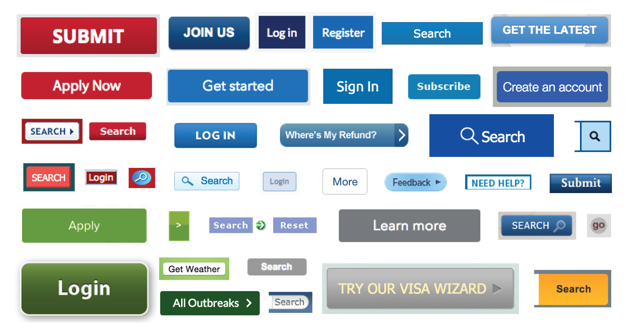
Indeed, poke around and it was possible to find a panoply of different button types across federal websites:
Ruskin also added that the federal government has been stewarding its design for a long time:
There is precedent for the U.S. government setting design standards in other arenas, such as highway signage and architecture. In the early 1970s, President Nixon initiated the Federal Graphics Improvement program in partnership with the National Endowment for the Arts. While this effort wasn’t focused on creating government-wide standards, it was a significant investment in upgrading the brand and visual standards of government agency’s materials. Famously, NASA's long-standing logo resulted from this effort.
More recently, the United Kingdom’s Government Digital Service—considered the gold standard as far as government technology is concerned—issued a “government service design manual” for that country’s websites. It instructed designers there to use an updated version of Transport, a typeface developed in the 1950s and 1960s for the U.K.’s highway system.
In the “consistent design” department, beyond the web, the U.S. also still has a long way to go to catch up with its northern neighbor. In the 1970s, the Canadian government initiated the Federal Identity Program, a unified set of standards meant “enable the public to recognize clearly federal activities by means of consistent identification.” The program brought the country’s logo not only to buildings and documents throughout the provinces—but also to a robotic arm that, for many years, whizzed 250 miles above Earth.