This is the first in an occasional series about abandoned Internet icons.
It was spring of 1997. "Mmmbop" was the pop song of the moment and unlimited access to AOL cost $19.95 a month. Dial-up Internet had finally tipped mainstream. People were talking about Buddy Lists and instant messaging the way Twitter followers and instagramming come up today.
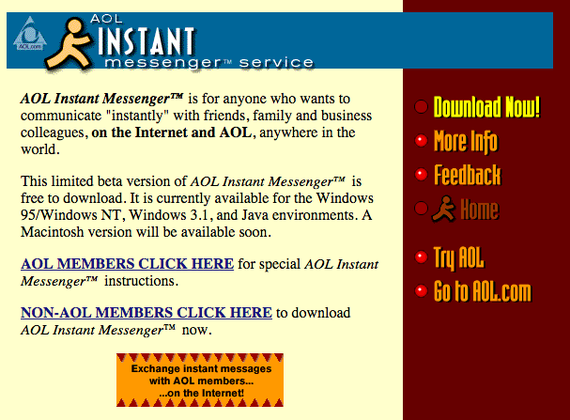
This was, AOL declared, a turning point in communications history. The company had decided to expand access to its AIM chat client to anyone online, not just paying members, promising to "revolutionize Internet communications worldwide." Here's how the company explained the service 17 years ago:
The Instant Message™ feature lets users send and respond to messages immediately while the Buddy List™ feature lets users know instantly when friends are online... AOL Instant Messenger™ makes it easy to send and receive private text messages using personalized AOL Instant Messenger™ "screen names."
As part of the branding effort for the platform—still in limited beta at the time—AOL unveiled a sunny icon that Internet users would come to associate with the service for years to come: the running man.
He popped up on the screen people saw when they were waiting for their modems to stop screeching. He was perched atop the Buddy List. He was splashed across the seemingly infinite supply of software CDs that AOL sent to homes across the United States. He appeared in a bizarre ad with Sharon Stone at the turn of the century and eventually made mascot-like appearances at offline events.
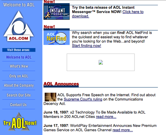
AOL quietly discontinued the bulbous-headed icon with a rebranding effort in 2011 after years of phasing it out. And like so many once-familiar visual representations of early Internet culture, he has faded from popular view. But you can still see him—mid-dash, leaping toward the future!—in these Wayback Machine screenshots of AOL's 1997 homepage.
I caught up with JoRoan Lazaro, who designed the icon for AOL when he worked there in the mid-90s. (Lazaro went on to work at EA, Second Life, and a handful of advertising agencies. Today he's creative director at The Martin Agency in New York.) Here's the lightly edited and condensed version of what he told me about the running man's origins.
* * *
"The design was part of a larger redesign effort that was in the first half of 1997 where we redid the entire client software and all of the content channels. It was a really great opportunity to jump into digital, which was a very nascent kind of a discipline back then. The version of AOL, the client software back then, was 3.0. It was still very—how do you say without being too negative?—it was still kind of primitive.
"The iconography looked a little bit more like Microsoft Word. There were rendered icons, they weren't labeled. It was sort of a functional interface. What we did as a design was we embedded a web browser into the client toolbar. That was significant because back then we were still literally teaching people how to 'surf the net,' use email. Instant messaging was brand new. This was a very new thing. There was no formal [web design] discipline, but I did have a background in design and magazine design.
"The [running man] design came about because I was spending a lot of time looking at 1940s and 50s postwar American logos and trademarks. If you go back to 40s and 50s logos and trademarks, you'll see that there's actually quite a few men that were used—a silhouette that either had curved legs or angular legs and a round head, in addition to the ones that looked quite a bit more stylized or looked really, really human. The running man was really inspired by those.
"If you go through the history of 40s and 50s design, you'll see there's a sideways man with a round head that was very similar. You can see that it looked very much like that. Back then, the brands were using a lot of anthropomorphic if not outright people figures. The brands were trying to communicate essentially that they were reliable, authentic, they had quality and personality. So they would have simple farmers or electricians or plumbers holding things. That was the core concept ... to actually have a person holding the objects that stood for something [across the toolbar]. There were hundreds of versions. The idea was there was a man holding a pencil for 'write email,' a man holding an envelope for 'read mail,' a heart for 'favorites.' I went for something that was quite a bit more literal. Up until [right before launch], there were a lot more people holding objects. But at the very end we decided to take out some of them because some discussion and some other things going on, we decided to just dial down the number of people on the toolbar.
"I just tried to simplify it. The other reason was, from a technical point of view, there were only so many colors you could use. Resolutions weren't very good. It was kind of a fun process of reduction—because of the limitations—with the simplicity of the old 40s and 50s logos being so stylized.
"Early on, we didn't really do a lot of focus grouping or testing. The hierarchy was very flat. There was a lot of, you could almost say gut instinct. [AOL leadership] was very brave in terms of being behind such a wholesale digital and functional redesign of the service. We were able to do something that was very different from everything else. The color schemes that I had were not standard. It was warm, friendly. It was a very different direction to take. So sort of going back to where the running man came from, that's where he came from. Because the company at the time was moving very quickly. The AOL Instant Messenger team actually took the man and started using it for AIM. Pretty soon he was just used everywhere. It was a very organic thing that just sort of evolved and pretty soon he was just attached to the brand.
"AOL, as a service back then, was specifically for regular people, everyday people. It was definitely not the bleeding edge. It was for just people that needed an email address and needed to learn how to use email or communicate. So there was a lot of that populous awareness. That's why there was a lot of referencing to what was the symbolism that appealed to most of America? It wasn't for people like myself, a designer with blue hair. It was definitely for everybody else between the coasts.
"If you can imagine a young designer going to a company like an AOL: My designer friends were like, 'What are you doing?' It's almost like going to work at Walmart. But when you look back on it, we learned how to design things for millions of people because it was easy to use. All the things that UX is based on now—we learned that on the fly.
"[Meeting people back then] I'd be like, 'I work for AOL. I actually designed that thing,' and they'd be like, 'Oh that's so awesome because my family's overseas and we use Instant Messenger.' It was actually kind of cool to hear what a difference it made in people's lives to communicate over long distances, which now we take for granted. The logo itself becoming such a part of the visual culture was cool, but at the same time it was just a small, ancillary thing. I think it was more important that we were doing good work that made a difference for people."
This article was originally published at http://www.theatlantic.com/technology/archive/2014/12/the-story-behind-aols-iconic-yellow-running-man/383652/
